
WPF的布局方式和Android的类似, 采用 XAML + cs 文件控制的形式.
0x01. WPF 布局原则
WPF的窗口只能包含单个元素, 如果在WPF 窗口中放置多个元素需要在窗口上添加个容器, 然后在容器中添加其他元素.
WPF 需遵循的布局原则如下:
- 不应显式设定元素的尺寸
- 不应使用屏幕坐标指定元素位置
- 布局容器的子元素共享可用的空间
- 可以嵌套布局容器
概括下来即: 不推荐使用绝对坐标布局, 布局中可以嵌套容器.
0x02. 布局过程
和Android 的布局过程不同的是, WPF的布局包括两个阶段:
- 测量(measure) 阶段
- 排列(arrange) 阶段
测量阶段是容器遍历所有的子元素,并获取子元素的期望尺寸.
排列阶段是容器在合适的位置放置子元素.
0x03. 布局容器
所有的WPF的布局容器的基类为 Panel (System.Windows.Controls) 抽象类面板, 此类的继承关系如下:
DispatcherObject
    - DependencyObject
        - Visual
            - UIElement
                - FrameworkElement
                    - Panel
此外, Panel 类有三个重要的共有属性:
- Background : 面板的背景
- Children : 面板中存储的条目集合
- IsItemsHost : 用户显示与ItemsControl 控件关联的项, 非自定义面板一般不适用该属性.
常用的核心 Panel 的实现类有:
StackPanel: 类似于 Android 中的线性布局, 水平或者竖直排列子元素WrapPanel: 可换行的布局容器DockPanel: 根据容器的便捷调整元素的面板Grid: 表格布局UniformGrid: 强制所有单元格相同的表格布局Canvas: 绝对坐标布局的面板
除了核心面板外, Panel 还有很多专业的实现, 如下:
System.Windows.Controls.Canvas
System.Windows.Controls.DockPanel
System.Windows.Controls.Grid
System.Windows.Controls.StackPanel
System.Windows.Controls.VirtualizingPanel
System.Windows.Controls.WrapPanel
System.Windows.Controls.Primitives.TabPanel
System.Windows.Controls.Primitives.ToolBarOverflowPanel
System.Windows.Controls.Primitives.UniformGrid
System.Windows.Controls.Ribbon.Primitives.RibbonContextualTabGroupsPanel
System.Windows.Controls.Ribbon.Primitives.RibbonGalleryCategoriesPanel
System.Windows.Controls.Ribbon.Primitives.RibbonGalleryItemsPanel
System.Windows.Controls.Ribbon.Primitives.RibbonGroupItemsPanel
System.Windows.Controls.Ribbon.Primitives.RibbonQuickAccessToolBarOverflowPanel
System.Windows.Controls.Ribbon.Primitives.RibbonTabHeadersPanel
System.Windows.Controls.Ribbon.Primitives.RibbonTabsPanel
System.Windows.Controls.Ribbon.Primitives.RibbonTitlePanel
1. StackPanel
StackPanel 默认为垂直排列布局, 用法如下:
<Window x:Class="WPFApp.MainWindow"
        xmlns="http://schemas.microsoft.com/winfx/2006/xaml/presentation"
        xmlns:x="http://schemas.microsoft.com/winfx/2006/xaml"
        xmlns:d="http://schemas.microsoft.com/expression/blend/2008"
        xmlns:mc="http://schemas.openxmlformats.org/markup-compatibility/2006"
        xmlns:local="clr-namespace:WPFApp"
        mc:Ignorable="d"
        Title="MainWindow" SizeToContent="WidthAndHeight" Width="200" Height="200">

        <StackPanel>
                <Button Content="Button1"  Height="24"/>
                <Button Content="Button2"  Height="24"/>
                <Button Content="Button3"  Height="24"/>
                <Button Content="Button4"  Height="24"/>
        </StackPanel>
</Window>
显示效果如下: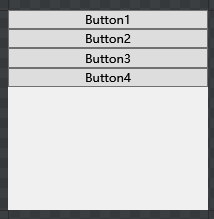
如果更改 StackPanel 的方向为水平:
        <StackPanel Orientation="Horizontal">
                <Button Content="Button1"  Height="24"/>
                <Button Content="Button2"  Height="24"/>
                <Button Content="Button3"  Height="24"/>
                <Button Content="Button4"  Height="24"/>
        </StackPanel>
显示则如下: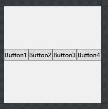
StackPanel 有几个比较常用的 attribute 属性可在 xaml 中配置:
- HorizontalAlignment : 子元素的水平布局对齐方式, 类似Android的Gravity. 可选: Center, Left, Right, Stretch
- VerticalAlignment : 子元素的垂直布局对齐方式, 可选: Top, Center, Bottom, Stretch
- Margin : 面板外部的边距
- MinWidth, MinHeight: 面板的最小宽度和高度
- MaxWidth 和 MaxHeight : 面板的最大高度和宽度
- Width 和 Height : 面板的宽度和高度
2. WrapPanel
使用WrapPanel面板承载上面的四个按钮,
<Window x:Class="WPFDemo.MainWindow"
        xmlns="http://schemas.microsoft.com/winfx/2006/xaml/presentation"
        xmlns:x="http://schemas.microsoft.com/winfx/2006/xaml"
        xmlns:d="http://schemas.microsoft.com/expression/blend/2008"
        xmlns:mc="http://schemas.openxmlformats.org/markup-compatibility/2006"
        xmlns:local="clr-namespace:WPFDemo"
        mc:Ignorable="d"
        Title="MainWindow" Height="150" Width="200">
    <WrapPanel>
        <Button Content="Button1"></Button>
        <Button Content="Button2"></Button>
        <Button Content="Button3"></Button>
        <Button Content="Button4"></Button>
    </WrapPanel>

</Window>
效果如下: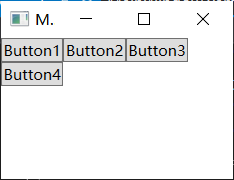
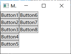
WrapPanel 和 StackPanel 类似, 默认布局方向会行, 可以手动修改为列:
<Window x:Class="WPFDemo.MainWindow"
        xmlns="http://schemas.microsoft.com/winfx/2006/xaml/presentation"
        xmlns:x="http://schemas.microsoft.com/winfx/2006/xaml"
        xmlns:d="http://schemas.microsoft.com/expression/blend/2008"
        xmlns:mc="http://schemas.openxmlformats.org/markup-compatibility/2006"
        xmlns:local="clr-namespace:WPFDemo"
        mc:Ignorable="d"
        Title="MainWindow" Height="150" Width="200">
    <WrapPanel Orientation="Vertical">
        <Button Content="Button1"></Button>
        <Button Content="Button2"></Button>
        <Button Content="Button3"></Button>
        <Button Content="Button4"></Button>
        <Button Content="Button5"></Button>
        <Button Content="Button6"></Button>
        <Button Content="Button7"></Button>
        <Button Content="Button8"></Button>
    </WrapPanel>

</Window>
效果如下:
3. DockPanel
Dock 和 Mac 的 Dock工具栏类似 可以选择一个边停靠, DockPanel 的子元素也可以选择一个边停靠, 例如:
<Window x:Class="WPFDemo.MainWindow"
        xmlns="http://schemas.microsoft.com/winfx/2006/xaml/presentation"
        xmlns:x="http://schemas.microsoft.com/winfx/2006/xaml"
        xmlns:d="http://schemas.microsoft.com/expression/blend/2008"
        xmlns:mc="http://schemas.openxmlformats.org/markup-compatibility/2006"
        xmlns:local="clr-namespace:WPFDemo"
        mc:Ignorable="d"
        Title="MainWindow" Height="150" Width="200">
    <DockPanel >
        <Button Content="Button1" DockPanel.Dock="Left"></Button>
        <Button Content="Button2" DockPanel.Dock="Top"></Button>
        <Button Content="Button3" DockPanel.Dock="Right"></Button>
        <Button Content="Button4" DockPanel.Dock="Bottom"></Button>
        <Button Content="Button5"></Button>
    </DockPanel>

</Window>
运行效果如下: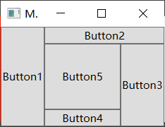
4. Grid
Grid是最常用的也是最灵活的布局面板, 新建Window 默认的布局就是 Grid:
<Window x:Class="WPFDemo.MainWindow"
        xmlns="http://schemas.microsoft.com/winfx/2006/xaml/presentation"
        xmlns:x="http://schemas.microsoft.com/winfx/2006/xaml"
        xmlns:d="http://schemas.microsoft.com/expression/blend/2008"
        xmlns:mc="http://schemas.openxmlformats.org/markup-compatibility/2006"
        xmlns:local="clr-namespace:WPFDemo"
        mc:Ignorable="d"
        Title="MainWindow" Height="200" Width="200">
    <Grid >
    </Grid>
</Window>
Grid 的缺省配置是 1行1列一个单元格. 如果要增加行和列,需要在 Grid 内部增加 Grid.ColumnDefinitions 和 Grid.RowDefinitions, 如下配置 2 x 3 的 Grid :
<Window x:Class="WPFDemo.MainWindow"
        xmlns="http://schemas.microsoft.com/winfx/2006/xaml/presentation"
        xmlns:x="http://schemas.microsoft.com/winfx/2006/xaml"
        xmlns:d="http://schemas.microsoft.com/expression/blend/2008"
        xmlns:mc="http://schemas.openxmlformats.org/markup-compatibility/2006"
        xmlns:local="clr-namespace:WPFDemo"
        mc:Ignorable="d"
        Title="MainWindow" Height="200" Width="200">
    <Grid >
        <Grid.ColumnDefinitions>
            <ColumnDefinition></ColumnDefinition>
            <ColumnDefinition></ColumnDefinition>
        </Grid.ColumnDefinitions>
        <Grid.RowDefinitions>
            <RowDefinition></RowDefinition>
            <RowDefinition></RowDefinition>
            <RowDefinition></RowDefinition>
        </Grid.RowDefinitions>
        <Button Content="Button1" ></Button>
        <Button Content="Button2" Grid.Column="1" Grid.RowSpan="2"></Button>
        <Button Content="Button3" Grid.Row="1"></Button>
        <Button Content="Button4" Grid.Row="2" Grid.ColumnSpan="2"></Button>
    </Grid>

</Window>
在 Grid的子元素中使用以下属性:
Grid.Row: 元素位置起始行, 从0开始, 默认为0Grid.Column元素位置的起始列, 从0开始, 默认为0Grid.RowSpan: 元素占用的行数, 默认为1Grid.ColumnSpan: 元素占用的列数, 默认为1
上述代码运行效果如下:
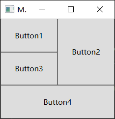
默认的行和列是均分, 可以手动设置行列尺寸, 如:
<Window x:Class="WPFDemo.MainWindow"
        xmlns="http://schemas.microsoft.com/winfx/2006/xaml/presentation"
        xmlns:x="http://schemas.microsoft.com/winfx/2006/xaml"
        xmlns:d="http://schemas.microsoft.com/expression/blend/2008"
        xmlns:mc="http://schemas.openxmlformats.org/markup-compatibility/2006"
        xmlns:local="clr-namespace:WPFDemo"
        mc:Ignorable="d"
        Title="MainWindow" Height="200" Width="200">
    <Grid >
        <Grid.ColumnDefinitions>
            <ColumnDefinition Width="50"></ColumnDefinition>
            <ColumnDefinition Width="150"></ColumnDefinition>
        </Grid.ColumnDefinitions>
        <Grid.RowDefinitions>
            <RowDefinition></RowDefinition>
            <RowDefinition></RowDefinition>
            <RowDefinition></RowDefinition>
        </Grid.RowDefinitions>
        <Button Content="Button1" ></Button>
        <Button Content="Button2" Grid.Column="1" Grid.RowSpan="2"></Button>
        <Button Content="Button3" Grid.Row="1"></Button>
        <Button Content="Button4" Grid.Row="2" Grid.ColumnSpan="2"></Button>
    </Grid>

</Window>
运行效果如下:
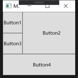
类似于Android的百分比布局, Grid也可以按照比例设置每行的尺寸, 同样也可以添加分隔条:
<Window x:Class="WPFDemo.MainWindow"
        xmlns="http://schemas.microsoft.com/winfx/2006/xaml/presentation"
        xmlns:x="http://schemas.microsoft.com/winfx/2006/xaml"
        xmlns:d="http://schemas.microsoft.com/expression/blend/2008"
        xmlns:mc="http://schemas.openxmlformats.org/markup-compatibility/2006"
        xmlns:local="clr-namespace:WPFDemo"
        mc:Ignorable="d"
        Title="MainWindow" Height="200" Width="200">
    <Grid >
        <Grid.ColumnDefinitions>
            <ColumnDefinition Width="*"></ColumnDefinition>
            <ColumnDefinition Width="2*"></ColumnDefinition>
        </Grid.ColumnDefinitions>
        <Grid.RowDefinitions>
            <RowDefinition></RowDefinition>
            <RowDefinition></RowDefinition>
            <RowDefinition Height="Auto"></RowDefinition>
            <RowDefinition></RowDefinition>
        </Grid.RowDefinitions>
        <Button Content="Button1" ></Button>
        <Button Content="Button2" Grid.Column="1" Grid.RowSpan="2"></Button>
        <Button Content="Button3" Grid.Row="1"></Button>
        <GridSplitter Grid.Row="2" ShowsPreview="True" Grid.ColumnSpan="2" HorizontalAlignment="Stretch" Height="1"/>
        <Button Content="Button4" Grid.Row="3" Grid.ColumnSpan="2"></Button>
    </Grid>

</Window>
运行效果如下:
")
如果将上述的 ShowsPreview="True" 删除或者 改为 False 怎不会预览直接改变大小.


